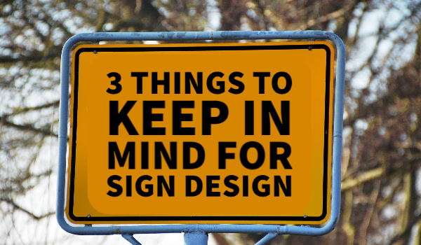
Whether you’re a small business or a big corporation, signage is a necessary component of marketing. The key with signage is to mix simplicity with contrast and color to create interest. However, this deceivingly simple idea actually requires some finesse. Here’s what you should remember about sign design.
Scale
Signs and banners can be anywhere from 11in by 14in to 14ft by 48ft. The scale of large signage can be intimidating for business owners. As such, it can lead to some errors with how you choose to design your signs.
But determining scale is easier than it looks. You should keep distance in mind as most signage is meant to be viewed from far away. Also, it’s important to think about how long your audience has to view signage. Someone driving by a billboard has a lot less time to understand you and your business from signage alone than a patron at a trade show. Utilizing an image may be key here.
Don’t try to use all of the space on your sign, as it will make your point hard to understand in the few seconds that someone might see it. You also should avoid oversimplifying your design unless you’re a very well-known business or corporation. Having just your logo on a sign may not register with consumers. If you’re working with a printing company, you may be able to consult with printing services about your signage before the printing process begins.
Location, Location, Location
Just as in real estate, the location of your signage is incredibly important. If you’re thinking about putting up new signage, you’ll want to think about where your audience would most likely be. However, do keep in mind that about 85% of your customers are within a five-mile radius of your business. The location of a sign also changes how you design it: you wouldn’t put the same design on a yard sign as you would on a billboard in Time Square. The area around the sign may change your color palette as well.
Another part of location planning is to consult the local area government about what you can and cannot have on a sign. Specific words, phrases, or images may not be allowed to be used on public signage. If you’re having trouble, consult local printing services about the rules and regulations.
Big and Bold
Color and contrast play a huge role in creating a sign. They also play a role in branding. You want to keep your colors consistent with the branding of your company, however, you should also use contrasting colors. This will help the text stand out and make things easier to read and understand. Keep your text to one to two sentences in length at most for a clear message. You should also make sure the font you choose is easily legible from a range of distances. You’ll also want to ensure the text is large enough based on the size: remember that for every 100 feet of visibility, you need 10 inches of letter height.
For graphic elements, choose one or two elements to go with your text. You don’t want to use too many elements or it can make your signage difficult to read. Make sure the graphic you choose is attention-grabbing and memorable so that sign is as effective as possible. Keep things simple, keep them bright, and keep them memorable.
You may also want to consider the material you’re having your signage printed on. There many varieties of material for signs, so be sure to discuss these options with your printing company.
Signage is important. Remember to keep scale and location in mind so know how it will be viewed. Then keep your design simple, impactful, and easy to understand. For any questions about signage, large scale printing, or other printing services, please contact us today!